Hi friends , welcome to my new blog….here I'm going to share about famous logos. Many logos have unidentified meaning in it. Now let we see what they are……..
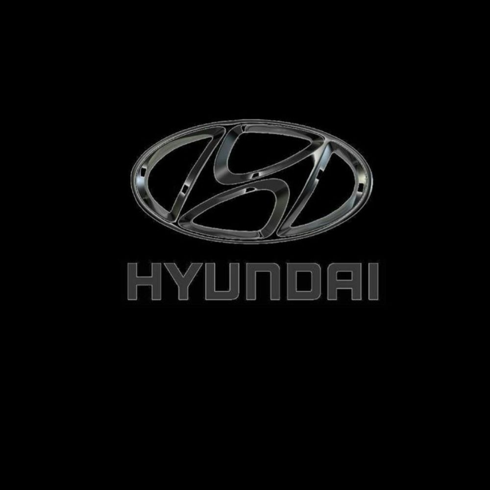
Friends you may think that by seeing this hyundai logo its nothing but the starting letter of hyundai. No it's not only the letter H ,if we see this deep we may identify two people that is a client and a representative of the company shaking hand.
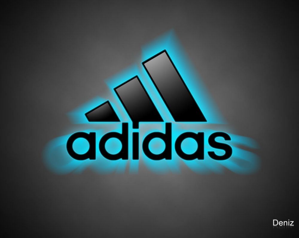
This adidas company has changed its logo over a period of time ,but which has always have the three stripes in it. The current logo three stripes denotes the formation of a triangle which looks like a mountain . And this represents the challenge that sportsman have to overcome day by day.
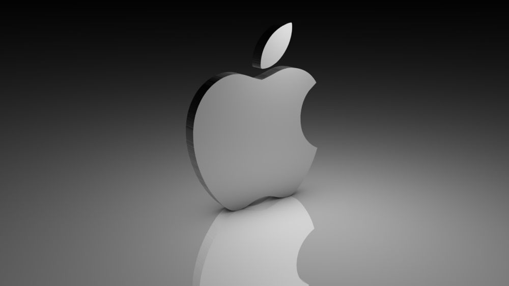
The famous apple company logo was designed by rob janoff. He in one of his interviews he explained about this Apple logo idea…that is , he bought a bag full of apple with him and kept down to draw it . His drawing gone for one week then he needs some break for his image to make it simply means. He bite that apple Completely by coincidence he realised that bite sounded exactly the same as the computer term bite .
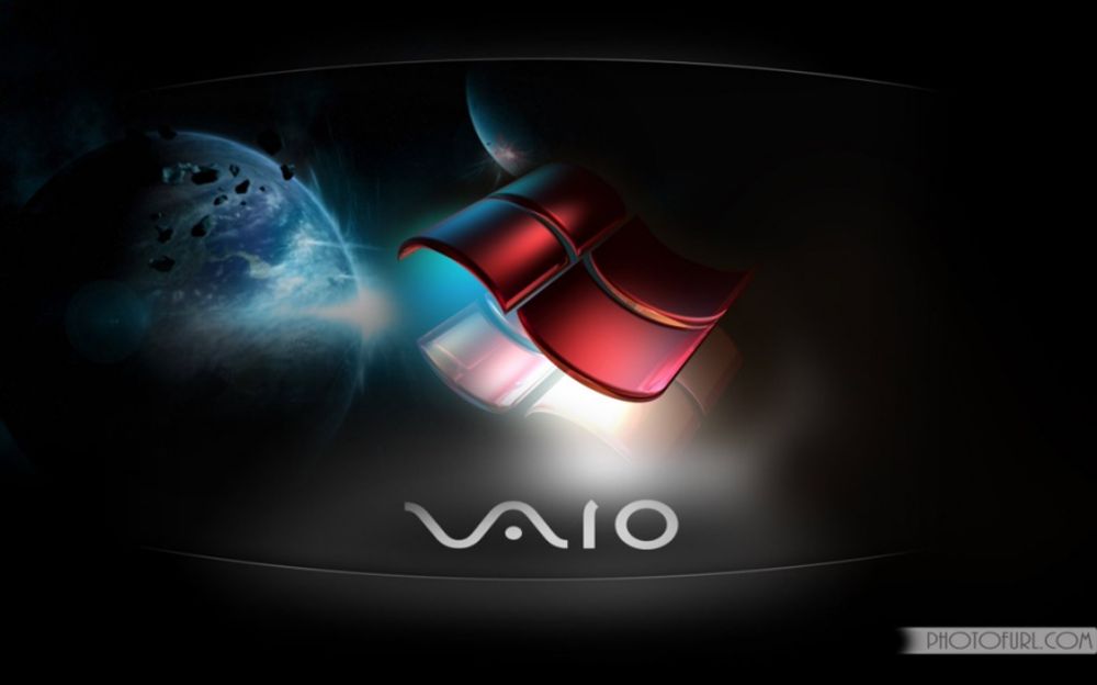
We all know about analog waves and digital signals .so here the first two letters of this vaio logo symbolizes an analog wave ,the last two are similar to the number one and zero that is symbols of a digital signal.
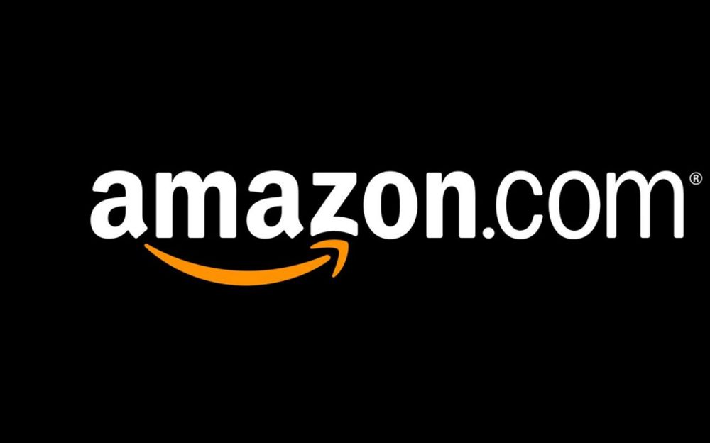
If we see in this logo ,we can't find nothing and nothing special in this logo .it's was designed only by its company's philosophy . But the orange arrow indicate the smile. That is, this company wants their customers to be satisfied with their products. This arrow streches from a to z ,which means a hint by the company selling every products .
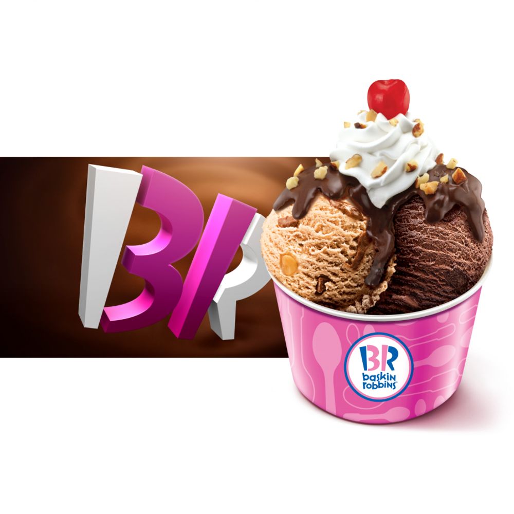 Baskin Robbins the pink coloured parts of the BR section make up the number 31 ,which is how many ice cream flavours baskin Robbins used to famously sell.
Many people compare the logo of this japanese car producer to an image of cowboy wearing a hat . Infact it represents a stylized image of a needle eye with a thread passing through it. This is the hint at the company's past. They used to produce weaving machines , However the individual part of the logo also spell out the letters of the company's name.
So ,Friends it's not an end . I will continue some more famous logos as part 2 in my another blog. If you've enjoyed this blog ,hit me a ♥️ button and comment it below……
Thanks for Reading 🙂
~Rekha