
Hi guys, welcome to my blog. Today I want to share some important points on color theory. We have been studying about colors since our childhood. But the color theory has a wide range of application in technology and design. In designing field, color is one of the important essential and fundamental tool. It is a unique and complex language. Sometimes usage of colour in designs and paintings represents particular region culture, psychology of mind and mood. So, it is in designers hand to choose right colors while designing apps or visual designs to grab the attention of the audience.
Color Terminologies
Color is mainly classified into three parts: hue, tone and saturation. A hue is nothing but colour. A single hue have many variations from light (tint) to dark (shade).
Tone or value is the relative lightness or darkness of color. A colour with added white is called tint but with added black is called shade.
Saturation represents full intensity to low intensity or brightness to greyness.
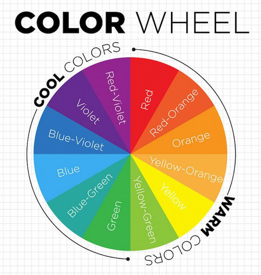
If we observe the color wheel complimentary colors like red and green lie opposite to each other whereas analogous colors like green and blue lie adjacent to each other.
Hues near the red spectrum appears as warm colors on the other hand hue near to blue spectrum views like cool colors.

Basically, in color wheel Red, Yellow, and blue are primary colors.
Secondary colors are those which are formed by mixing any two primary colors. Examples: Orange, Green, and Violet.
Tertiary colors are formed when primary and secondary ones are combined. Examples are red - orange, yellow - orange, yellow - green, blue - green, blue - violet, red - violet.
In digital medias, Televisions, and monitors we use RGB (Red, Green, Blue) system. In this system we use additive colors. These colors forms white light when combined.
Similarly we have another system called as CMYK ( Cyan, Magenta, Yellow, and black) system. The colors used here are subtractive colors. CMYK colours are used in printing press.
Important Points:
Advancing and receding: Colors in the red spectrum appears to advance to the human eyes while those in blue spectrum appears to be recede.
Vibration: Complementary colors of same intensity appears to be vibrant and causes an illusion of motion along the edges where they meet.
Weight: Sometimes colors differ in perceived weight. Generally it is assumed as red appears to be heavier whereas blue and green appear to be lighter.
In many designing fields like graphic design, UI/UX design, and animations etc., the role of color and its application is prominent. So, the designers should have proper knowledge on the fundamentals of colors.
Hoping my readers enjoyed the content.
Thanks for reading !!!
